College football
Notre Dame Breaks Tradition After 60 Years: Bold New Football Leprechaun Logo Sparks Fierce Debate..
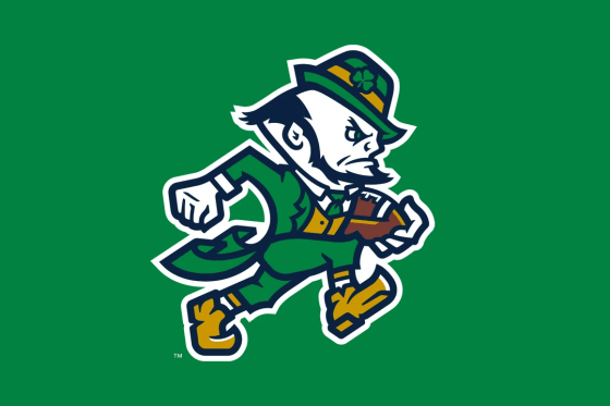
Notre Dame Breaks Tradition After 60 Years: Bold New Football Leprechaun Logo Sparks Fierce Debate..

For the first time in more than six decades, Notre Dame football has shaken up one of its most sacred traditions. The university unveiled a brand-new, football-specific Leprechaun logo, marking a dramatic departure from the emblem fans have associated with the Fighting Irish for generations. The updated design portrays the mythical mascot in a more athletic, competitive pose clutching a football rather than standing with fists raised in the iconic “fighting stance.”
The redesign is not an isolated move. According to athletic department officials, it’s the beginning of a larger rebranding project that will introduce sport-specific Leprechaun marks across Notre Dame athletics. Each version will adapt the familiar figure to fit the personality and identity of the program it represents, with football serving as the launchpad.

Since the early 1960s, the Fighting Irish Leprechaun has stood as a globally recognized symbol of grit, tradition, and defiance. For fans, alumni, and players alike, the logo is more than a cartoon figure—it embodies the fighting spirit of Notre Dame’s athletic culture.
The new logo, however, shifts that narrative. Gone is the small but scrappy figure squaring up for battle. In its place is a modernized Leprechaun, slightly more muscular, brimming with movement, and unmistakably tied to the sport with a football firmly in hand. University designers framed it as a way to align the mascot’s visual identity with the dynamism of today’s athletes while keeping the roots of tradition intact.
“Notre Dame football has always been about toughness, legacy, and pride,” an athletic department statement read. “This logo honors that history but reimagines it for a new era.”

Unsurprisingly, the rollout has triggered intense reactions across social media, alumni circles, and even national sports talk shows.
Supporters of the change argue that it’s a much-needed refresh. They praise the logo’s athleticism, calling it “stronger,” “more competitive,” and “better suited for a powerhouse program that still has its eyes on national titles.” Younger fans and students in particular seem enthusiastic, saying the redesign helps Notre Dame keep pace with other top programs who have modernized their brands.
Traditionalists, however, are far from convinced. Many view the original Leprechaun as untouchable, a sacred marker of continuity that links generations of Irish fans. To them, altering the emblem risks diluting Notre Dame’s identity. One fan bluntly wrote, “The old Leprechaun was Notre Dame. This looks like a corporate cartoon.”
The criticism hasn’t stopped there. Some skeptics went further, comparing the design style to something “generated by AI” rather than handcrafted by an artist. Others raised questions about commercial motives, speculating that the change is more about selling new merchandise than honoring tradition.
Inside Notre Dame, however, leaders see the redesign as the first step in a broader branding strategy that will extend far beyond football. Plans are already in motion for basketball, hockey, and other sports to receive their own Leprechaun adaptations.
The idea, according to university officials, is to give each program a unique identity under the same Fighting Irish umbrella. For example, a basketball-themed Leprechaun may feature a dribble or dunk pose, while hockey could highlight a stick and skates.
Branding experts say this move is consistent with what major programs across the country are doing. With college athletics increasingly operating like professional franchises, logos and merchandise have become critical revenue streams. Notre Dame, known for its fiercely loyal fan base, likely sees the sport-specific logos as both a marketing opportunity and a way to engage younger audiences.

The unveiling of the new football logo highlights the difficult balancing act facing storied programs like Notre Dame: how to evolve without erasing history. Few universities are more steeped in tradition than Notre Dame, where imagery, chants, and rituals are woven into the very fabric of the school’s identity.
The decision to alter something as iconic as the Leprechaun reflects a willingness to take risks in the name of modernization. Yet the backlash shows just how delicate such moves can be when heritage runs deep.
Some analysts suggest that the university may rely on a dual-brand approach, keeping the classic logo alive for ceremonial use—such as on helmets, historic jerseys, or alumni materials—while embracing the updated versions for everyday branding, social media, and merchandising.
The timing of the unveiling is no coincidence. Notre Dame enters the 2025 football season ranked in the top ten nationally and opens with a headline clash against Miami. By launching the new logo just days before kickoff, the university ensures maximum visibility on a national stage.
Whether fans embrace the redesign or continue to push back, one thing is clear: Notre Dame has started a new chapter in its visual history. For some, it’s an exciting step toward the future. For others, it’s a jarring departure from what made the program timeless.
And for the Fighting Irish, it sets up a season where the team will not only fight opponents on the field but also battle perceptions of its new look off it.
-
 Liverpool News4 months ago
5 Minutes AGO: A Poor Newborn Baby Was Abandoned in a Park Near His Home After The Leicester City Game, in Response To This Heartbreaking Situation, Star Trent Alexander Arnold Stepped In to Become The Child’s Guardian, Pledging To Pay All Living Expenses Until The Child Turns 18….
-

 Liverpool News4 months ago
“He Spoke To Me”: Trent Alexander-Arnold breaks Silence on Real Madrid Snub and Finally Reveal The Reason Why He’s Staying at Liverpool After an Advice From….
-
 Liverpool News4 months ago
“He visited my office yesterday to inform me about his decision to return to the Anfield this summer. I am not only disappointed in him, but I will also report Liverpool to FIFA for attempting to deceive us.” His return to Liverpool by the summer has been confirmed, but a major issue remains unresolved. HAVING NETTED 15 GOALS IN 6 MATCHES THE MONACO COACH IS DISAPPOINTED IN HIM RETURNING TO LIVERPOOL…..
-

 Liverpool News4 months ago
BREAKING NEWS: live from Fabrizio romano, “LET ME GO” Liverpool target set to hand in transfer request to join Liverpool with immediate effect. He said, “I’ve made it clear to the club—I want to leave. The moment I heard Liverpool were interested, my mind was made up. This is a club you don’t say NO to, and I won’t risk waiting around. This is my career, my future, and I’m taking control of it. I’m handing in a transfer request because I want to wear that red shirt. Let me go—this isn’t a request, it’s a warning. My decision is final. It’s Liverpool or nothing.” Yes this is the kind of players we want who want to play for the club and not for the money get him for us immediately the fans are celebrating….
-

 Featured2 months ago
🚨𝐄𝐒𝐂𝐋𝐔𝐒𝐈𝐕𝐀: ARDON JASHARI SARÀ UN NUOVO GIOCATORE DEL MILAN! 🚨 ✅ Accordo totale tra Club Brugge e AC Milan per Ardon Jashari! 🔴⚫️ Il trasferimento si chiuderà su una cifra tra i 37 e i 40 milioni di euro, inclusi bonus, oltre a una percentuale sulla futura rivendita. 💼 Contratto fino almeno al 2030, con stipendio stimato tra 2 e 3,5 milioni a stagione 📝 🔥 Ardon Jashari sarà rossonero. Un colpo chiave per il centrocampo del Milan ✅🔴⚫️
-
 Liverpool News4 months ago
IT’S FINALLY OFFICIAL:Trent Alexander-Arnold signs a new long-term contract with Liverpool Amid Motivational Goal Scored Against Leicester City, keeping him at the club until 2028….
-

 Featured2 months ago
🚨 ULTIM’ORA: CAOS IN SERIE A – La Roma starebbe elaborando un piano terrificante e minaccioso per strappare il difensore brasiliano alla Juventus, ma Tudor ha lanciato un avvertimento chiaro e diretto al club giallorosso, secondo quanto riportano alcune fonti…
-

 Liverpool News5 months ago
BREAKING NEWS: Arne Slot Makes Surprise Statement On Trent Alexander-Arnold’s Remaining Games for Liverpool After What Transpired On…


